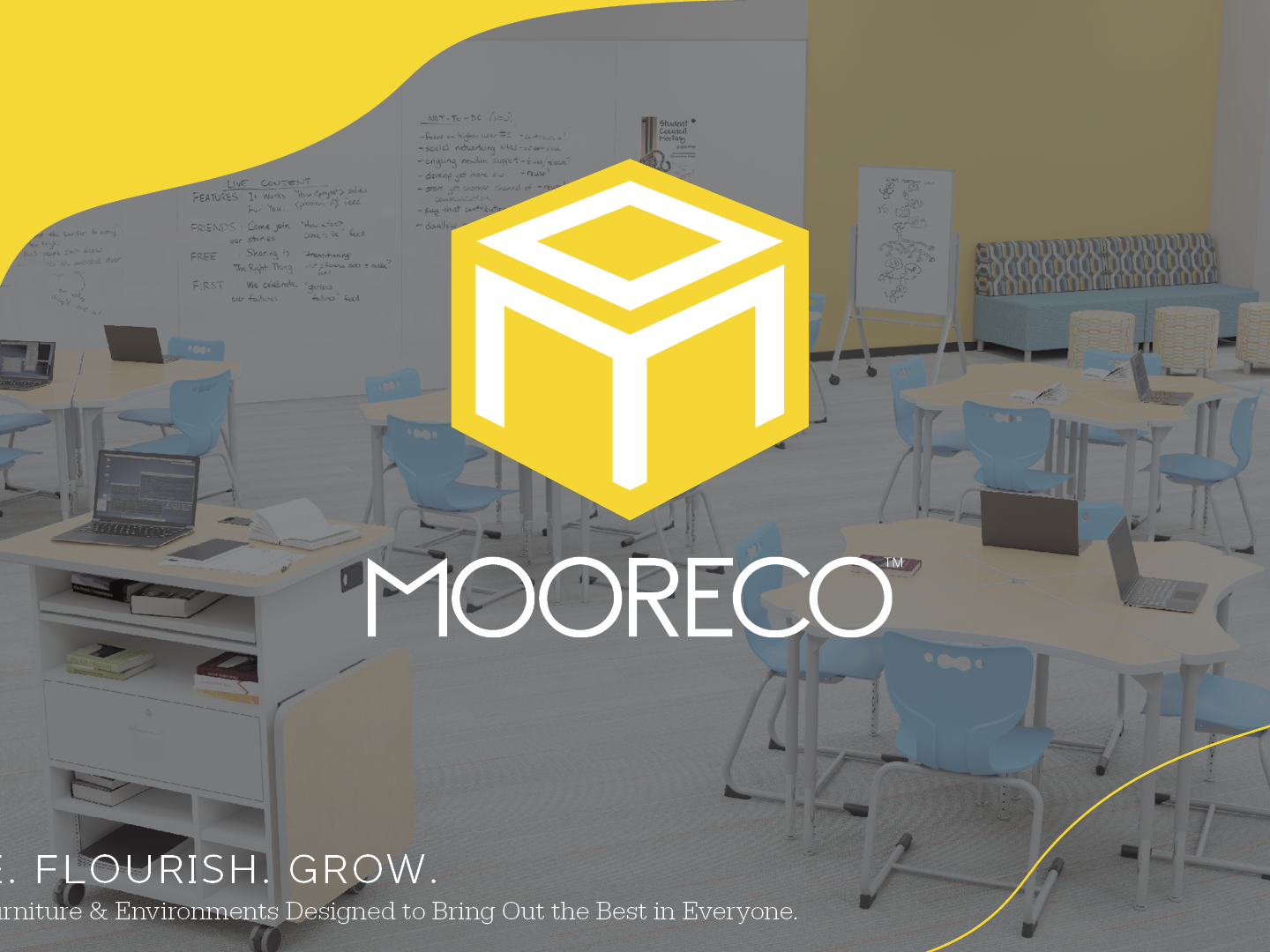
Overview
Challenge
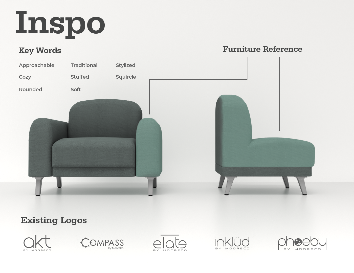
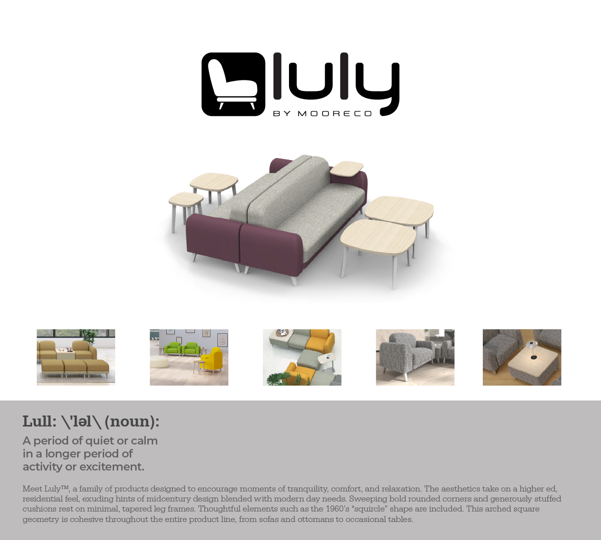
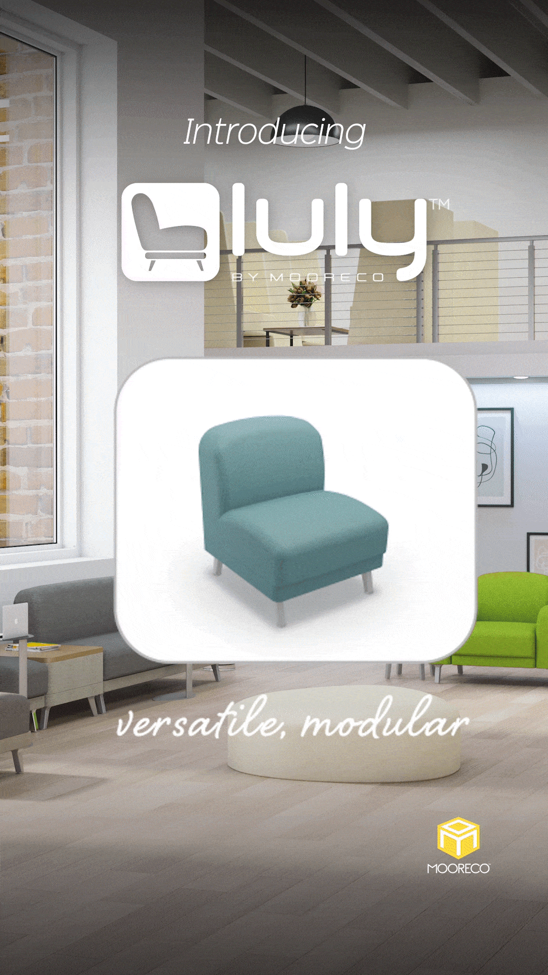
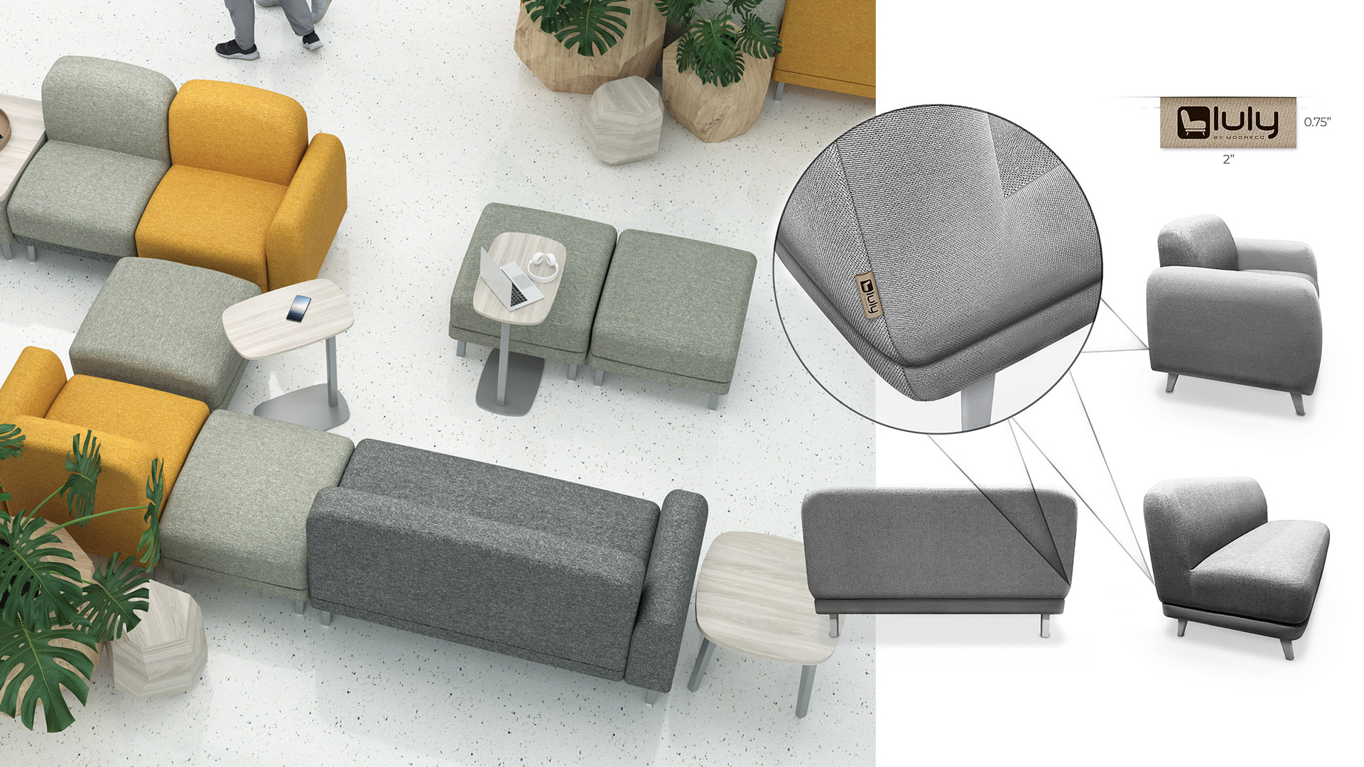
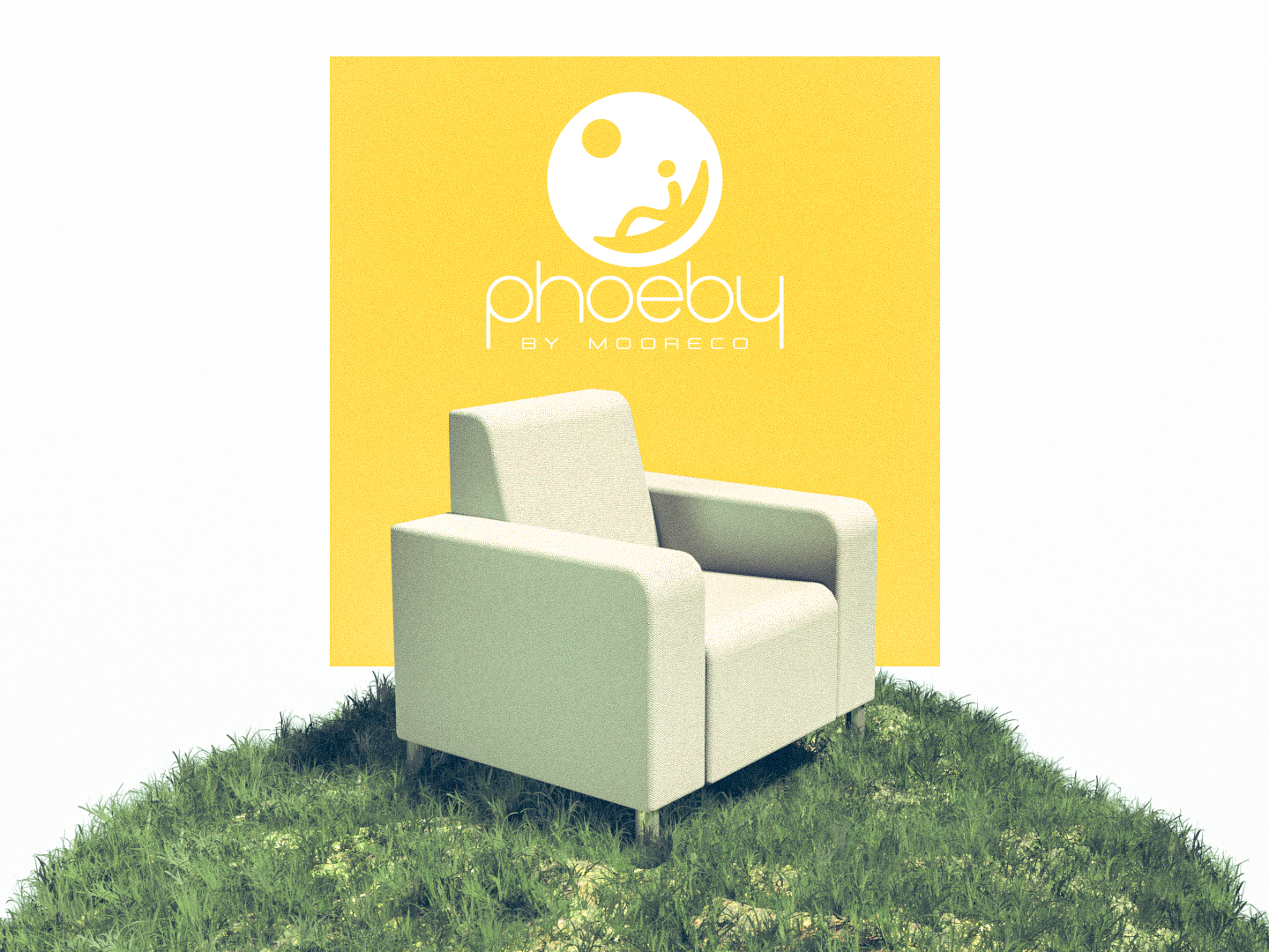
The new Luly™ Soft seating family takes on a higher-ed, residential feel, exuding hints of mid-century design blended with modern day needs. Sweeping bold rounded corners and generously stuffed cushions rest on minimal, tapered leg frames. Thoughtful elements such as the 1960’s “squircle” shape are included. This arched square geometry is repeated across this and other product lines, for example, in tabletops, risers, and stand-off knobs.
Create a logo for the Luly™ Soft Seating Family. The mark should feel approachable and familiar to our traditional market while also appearing stylized, rounded, and cozy.
The Luly line features generously stuffed cushions inspired by the 1960s “squircle,” so the logo should visually echo the soft, rounded geometry and overall concept of the chair design. The mark should incorporate or reference the silhouette of the product line.
It is essential that the logo maintains strong cohesiveness with MooreCo’s existing product lines, aligning with the brand’s established visual language while still expressing the unique character of Luly.
Team
Execution
Graphic Designer: Joseph Plata
3D Environment Designer: Joseph Plata
Render Artist: Joseph Plata
3D Modeler: Joseph Plata, MooreCo Engineering Department
3D Environment Designer: Joseph Plata
Render Artist: Joseph Plata
3D Modeler: Joseph Plata, MooreCo Engineering Department
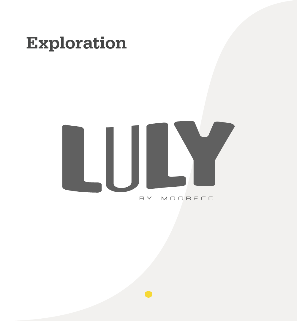
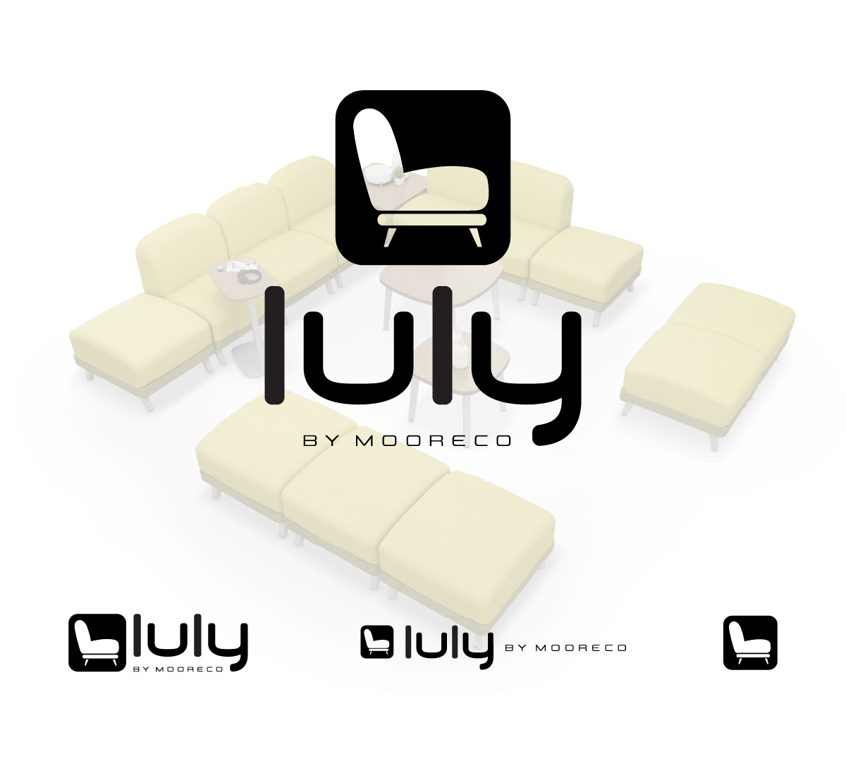
For this project, I drew inspiration from the generously stuffed curves of the Luly Soft Seating line. To maintain familiarity with MooreCo’s traditional market, I built upon the brand’s established monoline logo style and softened it—rounding and thickening the letterforms to feel “stuffed” and approachable. The 1960s-inspired squircle geometry of the chair’s arms is echoed in the open counters of the “U” and “Y,” reinforcing the cozy, rounded aesthetic while keeping the mark clean and cohesive with MooreCo’s visual language. I also observed that the chair’s side-profile silhouette forms a natural rounded “L,” which became the basis for a simplified, stylized symbol that references the product line while preserving brand consistency.